Stories from R-Co / Friday 23 June
Inspiring Melbourne


Making Melbourne: Cricket Australia
The emotional connection with sport branding is very powerful.
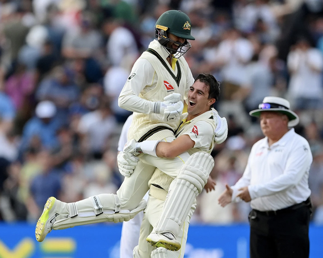
This week, the Essendon Football Club brand identity review made passionate front page news, and on a global stage the Australians lead the Ashes with a 01 win at Lord’s in London. The triumphant photo of Pat Cummins and Nathan Lyon says it all.
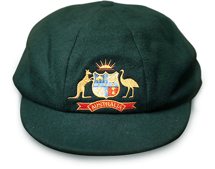
For Australian cricketers, wearing a Baggy Green cap signals status and instant universal recognition of origin and attitude.
It has been said that the Baggy Green is the most valuable item of clothing in Australia. Shane Warne’s raised over $1million at auction.
As brand iconography the Baggy Green uses the traditional heraldic crest to link the past with the modern game.
The Cricket Australia logo provides the contemporary relevance with it’s imagery of the golden sun casting shadows across the green turf with the Southern Cross, all composed in a battle shield.
The sounds of glory can be heard in the imagery of the afternoon light.
The careful craft of design in both identities elevates the stature of the brand impression by providing the lustre of classic quality, something missing with many sport brands.
The brand strategy behind the use of the shield can be seen in the extensions which enables state brands (e.g Cricket Victoria) to be expressed within a master brand cricket strategy.
This strategic thinking, that supports the business plan, delivers valuable brand advantage. It defines that Cricket stands for something.
However, beyond the brand strategies, the iconography and the values they convey, is something much deeper and more significant.
As Shane Warne said “You don’t need to wear a Baggy Green cap to say you love playing cricket for Australia.”


If you’re interested to chat more about how we approach sporting brand identity projects such as this one, please get in touch.


